Required security profile permissions: inContact Interaction Analytics Pro View
The Overview Bar Widget displays big picture information about the data in the topic. It can show the number of contacts per hour, per day, and total in the topic, and increasing or decreasing trends in the number of contacts; the percentage of contacts per sentimentThe overall mood of the contact, or the result of the call as determined by analysis of words, phrases, and context of the transcript. An interaction can be positive (blue), negative (red), mixed (dark gray), or neutral (light gray).; and how sentiment is changing over time. If sentiment is steady and then rapidly changes, you see volatility.
Read the Chart
The Overview Bar Widget can contain any combination of the following sections, or all three:
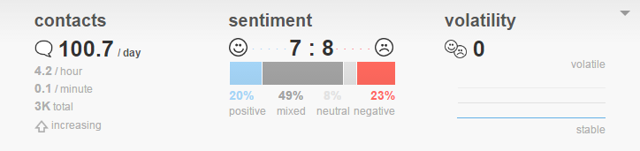
Contacts
Displays the average number of contacts that occur in the topicA set of voice, email, or chat transcriptions from your contact center that spans a specific period of time and matches your specified filter criteria. per day, per hour, and per minute; the total number of contacts in the topic; and whether the contact volume is increasing or decreasing.
Sentiment
Displays the percentage of contacts per sentimentThe overall mood of the contact, or the result of the call as determined by analysis of words, phrases, and context of the transcript. An interaction can be positive (blue), negative (red), mixed (dark gray), or neutral (light gray).. It also reports the ratio of positive contacts to negative ones.
Volatility
Displays the rate at which sentiment changes from positive to negative. The line is higher when there are more rapid changes in sentiment and is lower when the sentiment changes stabilize.
Export Overview Bar Chart as CSV
These instructions detail how to export the chart into .csv format.
- Click the down arrow in the top right corner of the chart.
- Click Export.


